- HubPages»
- Home and Garden»
- Home Decorating»
- Interior Design & Decor
How to Solve 11 Common Decorating Problems with Color and Pattern


Professional Designer's Tricks to Fix 10 plus 1 Common Interior Decorating Problems
This page dicusses 11 common interior decorating problems and teaches you the tricks interior designers use to correct them with pattern and color.
Creating a home decorating magazine-worthy room does not take magic or a lot of money. It is much easier than pulling a rabbit out of a hat and you can do all of these tricks yourself.
Whether you have a long narrow room, low ceilings, furniture you want to feature or make less noticeable, or other problems commonly encountered when decorating a space, we've got some easy-to-learn and DIY slight-of-hand secrets the professionals use to fix such things.
1. Low Ceilings?
Make them seem higher
Vertical Stripes make a ceiling look higher. Try a striped wallpaper on the walls with a light neutral color or the lightest tint of a color in the striped pattern on the ceiling to visually "raise the roof."
Ceiling still seems too low? Paint the baseboard and ceiling moldings, if you have them, the same color as the walls or try a satin or eggshell finish (a soft subtle sheen) in an almost-white on the ceiling with flat paint on the walls.
Conversely, vertical stripes will also make a high ceiling seem even taller and more dramatic.
Live in an Apartment? Can't Wallpaper or Paint Stripes on the Wall?
Did you know you can cover
your walls in fabric by "glueing"
it on with liquid starch?
( and Fabric can be removed easily)
See how at http://chezchazz.hubpages.com/hub/how-to-use-fabric-as-a-wall-covering
Need a Stripe of Another Color?

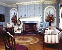
2. Too High a Ceiling? - Want it to look lower?
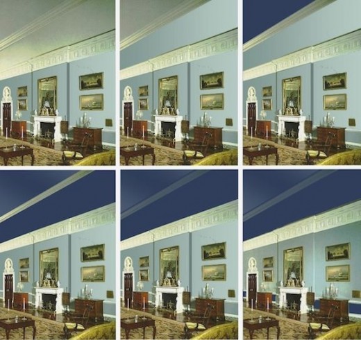
The photo used above comes from American Federal Period Interior Design and Home Décor. Original courtesy of http://www.state.gov/
Need a ladder to paint your ceiling? Choose a safe, sturdy one.

Yup. The opposite of #1 will do the trick. Darker colors visually lower a ceiling. Or add a horizontal stripe by installing a chair rail around the room in a contrasting color.
Paint the walls below the rail in one color and above it in another. Or use coordinating wallpapers to define the space above and below the rail.
Ceiling still seems too high? Extend the ceiling color down the top 8 to 12 inches of the wall.
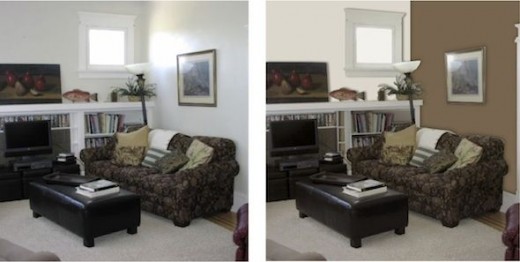
3. Large Room lacks style and warmth?
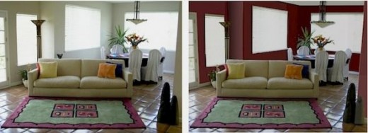
Which do you like better?
Darker shades of warm colors will create a cozier space with a more intimate ambience. Be sure to use flat paint on the walls.
The only thing we changed in this photo is the wall color. There's more that can be done to further improve the room, but we wanted you to see the huge difference that simply changing the wall color makes.
4. Focal point lacks focus?
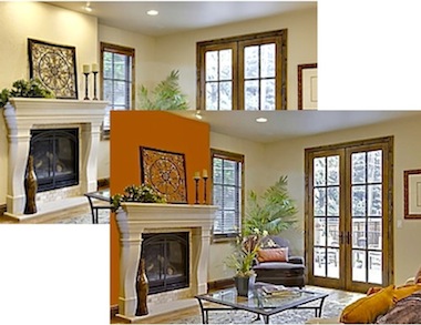
Draw attention to your fireplace, media center, armoire or other focal point by painting the wall behind it a deeper richer hue or shade than the other walls.
Good Tools Are Essential For Professional Looking Results

5. Open floor plan lacks unity?
Wide doorways? Flowing spaces? Tie it together and keep it looking cohesive but organized by function by carrying one color or pattern throughout, varying tint, shade, and placement to define areas.
For example, you might use the same "feature" color or pattern on one area's walls, and below a chair rail in another, for bedding or a sofa in another area, and even on a ceiling in another. Go for a coordinated look but don't get too "matchy" as that can be boring.
(continued below photo)

For example, in the open floor plan in the photos shown above, the use of similar colors ties the areas together into a cohesive space. Note that the blues do not match. The variety of blue tones blend together and makes the room more interesting. It may not be noticeable in the picture, but the walls in the living area are a cream-on-cream duo-toned stripe, not a solid. The matte finish wallpaper contrasts with the semi-gloss finish of the woodwork and fireplace, which is repeated on the kitchen cabinets.
The kitchen, which is also open off the living/dining area has a blue tiled backsplash and blue granite countertops. The blue floral stripe used for the window treatments in the dining area is also used for the valence in the kitchen windows. The blue is also carried through in the rooms' accessories, from the coffee table flower arrangement and he painting above the mantel to the kitchen accessories such as the light blue enamel cookware and dark blue striped pottery bowl in the kitchen.

6. Room seems too short or too square?
Use a warm color on three walls and a cool color on the fourth. The "cool" wall will appear to recede and the room will look longer.
Shades of red, yellow, and orange are considered "warm" colors while those in blue, violet, and green ranges are "cool" colors.
Adding white to a color creates a tint of that color and makes it cooler, softer and makes more delicate (think pastel). Adding black to a color deepens and darkens it, making it warmer.


7. Long, narrow room?
In a predominantly cool or neutral colored room, paint the farthest narrow wall in a rich warm shade and it will make the room look shorter because it will visually appear closer.
Even using just one shade or tint darker on the narrower walls than on the longer ones will make the room look wider, as done in the example shown here, although the illusion works a lot better in three dimensional space.
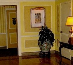
8. Room lacks natural light or has no windows?

Don't knock a hole in the wall, especially if your space is rented! You can add framed mirrors or a trompe l'oeill window (a poster or mural stick-on that looks like the real thing) but be careful not to make it look tacky, unless you're going for a kitschy look.
As for color, most people would probably be happier with a lighter color on the walls with a soft sheen (that will reflect the light). Flat paint and matte finishes absorb light and, although darker matte finishes can be very dramatic and effective in small spaces, it is harder to pull that off successfully.
Open Up a Windowless Room With Mirrors

Mirrors add a decorative touch, open up a space, and prevent a small windowless room from feeling closed in. You can find one to go with any style of décor and to fit any budget. The mirrors shown the above (and more) are available at Amazon.com.
Or trompe l'oeil ("fool the eye") accents

9. Lackluster Furnishings? - If reupholstery or slipcovers are not options...
Using a color similar to the furniture will make it less visible, but unless handled very skillfully, this can easily be boring and monotonous. However, using bold colors on the wall will distract attention from the furnishings and add style to the room.
Conversely, if you want the furniture or artwork in a room to stand out, keep your walls dressed in more neutral tones that will complement but not detract from the pieces in the room. A few throw pillows that echo the wall color and add some pattern will also help.

10. Architectural Details?
Contrasting colors will make architectural details stand out. If you have stained wood moldings, highlighting them with gold paint or gold leaf will add emphasis. If you prefer to paint the trim in a lighter, whiter, tint, try using a bold color on one or more features, such as a deep red or green door. Or paint part of the trim in a gloss black or color.
Remember: The secret to using any bright color effectively and to keep it from looking garish is to do so in moderation. Do not get carried away. A roomful of brightly colored molding can look harsh and tasteless.
If you do not have "show off" architectural details or have features you would rather not emphasize, stick to one color to hide the flaws or irregularities (in matte finishes only - any sheen will accentuate a flaw) or add interest to draw the eye elsewhere with a bold graphic in a contrasting color applied to or painted on the wall.
Removable Wall Graphics Add Architectural Interest
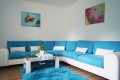
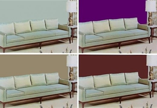
11. Too Small a Room?
Contrary to popular belief, white or lighter colors in and of themselves do not always make a room look larger, but they do make it look (and feel) colder. You can visually warm and expand a room with color by painting the walls a color similar to the color of your bedding or sofa or other large piece of furniture.
For example, if you have a large brown sofa, the room will look larger if the wall behind it is a deep taupe. The similarity of the colors and shades will trick your eye into thinking the space is bigger. That is, it will not stop the eye as, say, a brown or even a burgundy sofa against a white wall would. This is harder to see in a flat picture but much easier in an actual 3-D space.
For More Interior Decorating Tips

Subscribe to Our Blog
Historic Period Interior Design and Home Décor
So Glad You Stopped By!

You might also be interested in these - Related topics
Top 10 Interior Decorating Mistakes and How to Avoid Them
You don't have to be a professional interior decorator to understand and apply some basic principles of interior design that will help you create a comfortab...
How to Hang Pictures (and Other Stuff) on Your Walls
This DIY Guide shows you how to hang artwork, individual shelves or shelving units, closet organizers, cabinets, curio cases, media storage, speakers, flat s...
Choosing and Using Color in Your Home
Choosing and using paint colors can be frustrating and confusing for many reasons. The human eye can distinguish between millions of colors yet, whether desp...
How to Mix Fabrics For A Custom Look in Home Décor in 5 Easy Steps
We've put together five easy-to-follow guidelines and lots of pictures to makeit easy for you to achieve an expertly put-together room that expresses you...